
System overview
- Hero
- stacked · left
- Surface
- light
- Density
- sparse
- Content width
- 1032px
- Confidence
- medium
- Primary action
- None detected
Color system
Light surfaces use 7 repeated semantic colors; hierarchy is carried mainly by tonal contrast.
Page canvas
Dominant rendered page background.Surface
Repeated container or section fill; relative occurrence score 76.Surface
Repeated container or section fill; relative occurrence score 36.Surface
Repeated container or section fill; relative occurrence score 23.Primary text
Observed display foreground with 17.2:1 contrast against the captured canvas.Secondary text
Observed reading foreground; measured canvas-reference contrast is 6.6:1.Border and divider
Most repeated inspectable border color.Typography
A single-family system uses Instrument Sans across display and reading roles, differentiated by size and weight.
Metric previews use the observed CSS values. Source font files are not bundled, so unavailable families fall back locally.Foundation models on event data
Instrument Sans · 58px/61.48px · weight 500 · tracking -2.32px · color rgb(22, 24, 28)One model, every prediction
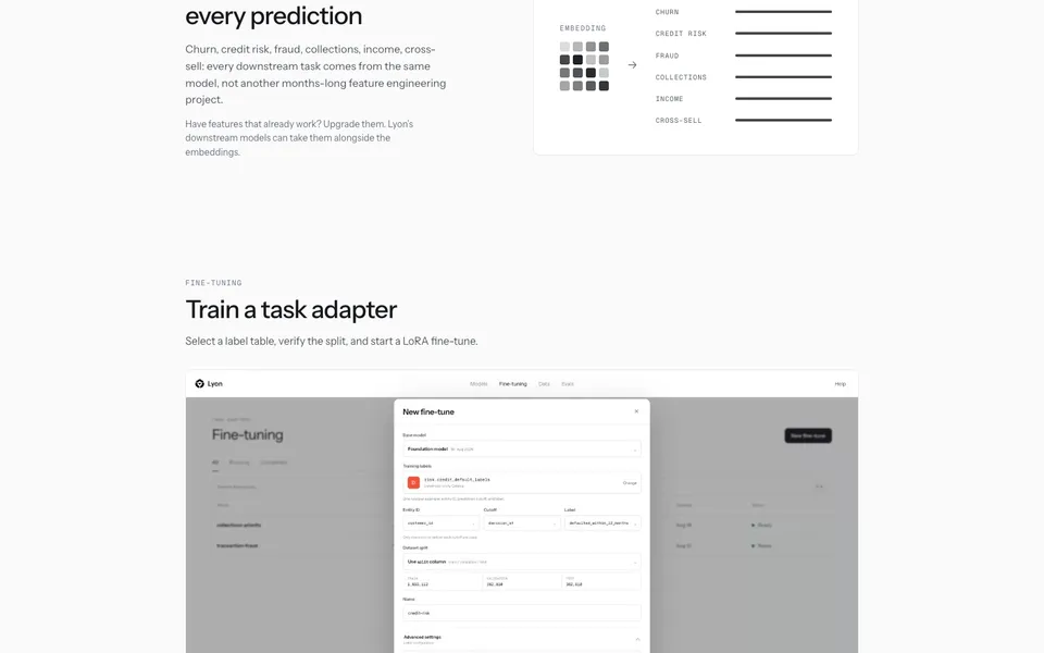
Instrument Sans · 38px/43.7px · weight 500 · tracking -0.95px · color rgb(22, 24, 28)Churn, credit risk, fraud, collections, income, cross-sell: every downstream task comes from the…
Instrument Sans · 16.5px/25.575px · weight 400 · tracking 0px · color rgb(86, 91, 99)Have features that already work? Upgrade them. Lyon’s downstream models can take them alongside the…
Instrument Sans · 14px/21.7px · weight 400 · tracking 0px · color rgb(107, 114, 128)Trust Center
Instrument Sans · 13px/20.15px · weight 400 · tracking 0px · color rgb(107, 114, 128)Spacing & shape
Spacing
- Base unit
- 4px
- Section gap
- 80px
- Container
- 18px
14px18px28px10px80px24px20px13px6px26pxShape
Soft geometry is the dominant shape voice. Separation relies on borders and surface contrast rather than shadow.
- Containers
- 3px
- Pills
- 2px
- Cards
- 10px
- Media
- 0px
Inspect borders & shadows · 2
1px solid rgb(230, 231, 233)None observedComponent grammar
Hero
Opening proposition
Stacked, left-aligned opening anchored by the primary message.
Inspect 4 properties
- Pattern
- stacked
- Alignment
- left
- Heading
- Instrument Sans · 58px / 500
- Media
- image-led
Navigation
Global wayfinding
Static navigation with 2 visible actions in the desktop opening.
Inspect 7 properties
- Text
- #16181c
- Border
- none
- Radius
- 0px
- Padding
- 0px 0px 0px 0px
- Type
- Instrument Sans · 16px / 400
- Position
- static
- Height
- 22px
Content card
Repeated content module
2 style-matched content card instances were found among 3 candidates; properties describe the dominant observed cluster.
Inspect 6 properties
- Text
- #16181c
- Border
- none
- Radius
- 0px
- Padding
- 0px 0px 0px 0px
- Type
- Instrument Sans · 16px / 400
- Candidate pool
- 3
Media frame
Visual proof
2 style-matched media elements were found among 4 rendered candidates; fill fitting and 0px are the most repeated treatments.
Inspect 4 properties
- Fit
- fill, contain
- Ratios
- 1.00, 2.06, 1.60
- Radius
- 0px
- Candidate pool
- 4
Footer
Closing navigation
3 visible actions close the page on a transparent surface.
Inspect 6 properties
- Text
- #16181c
- Border
- none
- Radius
- 0px
- Padding
- 26px 24px 40px 24px
- Type
- Instrument Sans · 16px / 400
- Links
- 3
Layout & narrative
The homepage continues through 3 observed sections, moving from the opening proposition into One model, every prediction, Train a task adapter, Your data never leaves your cloud.
- Structure
- Stacked product narrative
- Hero pattern
- Stacked hero: message leads into visual proof within the opening
- Grid
- 2 columns
- Closing
- Utility footer with 3 actions
Full section sequence · 3
- One model, every prediction
- Train a task adapter
- Your data never leaves your cloud
Imagery, motion & responsive
Imagery
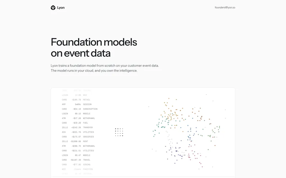
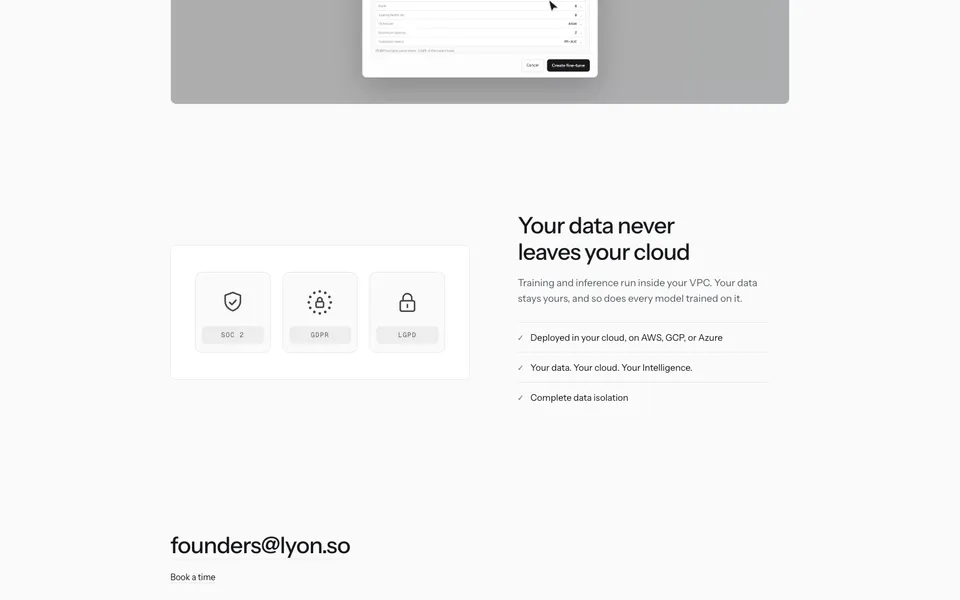
Image led media acts as the page’s primary visual proof rather than decoration.
fill fitting · square-edged framesInspect imagery inventory
- Composition
- A focused visual anchors the first viewport.
- Inventory
- 3 images/canvas elements and 1 video across the analyzed homepage.
Motion
1 declared keyframe and 9 active animations were inspectable at capture; observed timing uses 0.33s, 500ms.
No reduced-motion rule detectedInspect motion inventory
- Libraries
- CSS / browser-native or bundled source not identifiable
- Keyframes
- fade-in
- Durations
- 0.33s, 500ms
- Easings
- cubic-bezier(0.5, 1, 0.89, 1), ease, ease, linear
- States
- hover, focus
Mobile
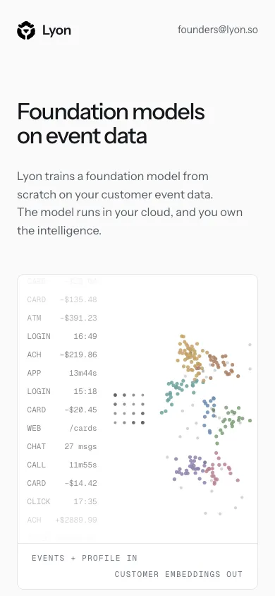
The same 2 visible navigation actions remain at mobile width. Hero alignment changes from left to center; mobile heading size is 32px.
Observed multi-column desktop regions collapse to a single-column mobile flow.Inspect responsive test
- Viewport
- 390 × 844
- Overflow
- No horizontal overflow detected
Reproduction guidance
Do
- Pair the observed #fbfbfb canvas with #16181c primary copy before adding secondary surfaces.
- Use Instrument Sans at 58px/61.48px, weight 500, for the primary display moment.
- Let the left-aligned stacked hero establish hierarchy before secondary content.
- Image led media acts as the page’s primary visual proof rather than decoration.
Don’t
- Do not mix in arbitrary radii; 3px is the repeated treatment on containers.
- Do not introduce an accent hue that is absent from the captured palette.
- Do not introduce extra type families beyond Instrument Sans.
- Do not add card shadows; the source separates content without repeated elevation.