
System overview
- Hero
- visual-led · center
- Surface
- light
- Density
- sparse
- Content width
- 1600px full-width canvas
- Confidence
- medium
- Primary action
- Get early access
Color system
Light surfaces use 8 repeated semantic colors; the primary action carries the strongest interactive emphasis.
Page canvas
Dominant rendered page background.Surface
Repeated container or section fill; relative occurrence score 148.Surface
Repeated container or section fill; relative occurrence score 117.Surface
Repeated container or section fill; relative occurrence score 24.Primary text
Observed display foreground; its canvas-reference contrast is 1.0:1 and may rely on a local hero surface.Secondary text
Observed reading foreground; measured canvas-reference contrast is 4.7:1.Primary action
Fill used by the dominant first-viewport action.Border and divider
Most repeated inspectable border color.Typography
The observed type system assigns Instrument Serif to display, heading text; Instrument Sans to body, body-small, label text.
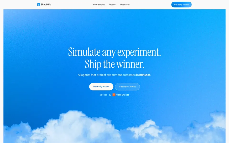
Metric previews use the observed CSS values. Source font files are not bundled, so unavailable families fall back locally.Simulate any experiment. Ship the winner.
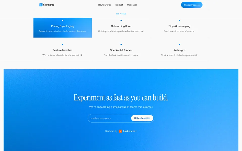
Instrument Serif · 80px/84.8px · weight 400 · tracking -1.92px · color rgb(255, 251, 245) · preview scaledExperiment as fast as you can build.
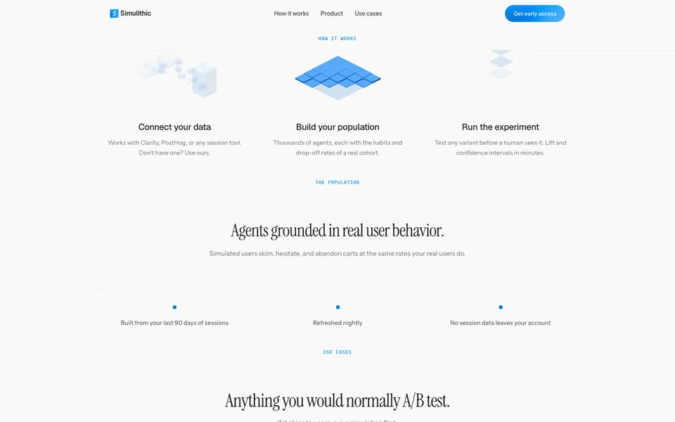
Instrument Serif · 56px/58.24px · weight 400 · tracking -1.4px · color rgb(255, 251, 245)Simulated users skim, hesitate, and abandon carts at the same rates your real users do.
Instrument Sans · 15.5px/26.35px · weight 400 · tracking 0px · color rgb(114, 114, 114)Test any variant before a human sees it. Lift and confidence intervals in minutes.
Instrument Sans · 14.5px/23.925px · weight 400 · tracking 0px · color rgb(114, 114, 114)Get early access
Instrument Sans · 13.5px/20.25px · weight 500 · tracking 0px · color rgb(255, 251, 245)Spacing & shape
Spacing
- Base unit
- 4px
- Section gap
- 40px
- Container
- 16px
16px40px30px26px10px18px8px28px20px12pxShape
Sharp geometry is the dominant shape voice. Separation relies on borders and surface contrast rather than shadow.
- Containers
- 1px
- Pills
- 999px
- Media
- 0px
- Inputs
- 0px
- Buttons
- 0px
Inspect borders & shadows · 3
1px solid rgb(240, 240, 240)1px solid rgba(255, 251, 246, 0.549)None observedComponent grammar
Hero
Opening proposition
Visual led, center-aligned opening anchored by “Get early access”.
Inspect 4 properties
- Pattern
- visual-led
- Alignment
- center
- Heading
- Instrument Serif · 80px / 400
- Media
- image-led
Navigation
Global wayfinding
Persistent navigation with 5 visible actions in the desktop opening.
Inspect 8 properties
- Background
- #f9f9f9
- Text
- #262626
- Border
- none
- Radius
- 0px
- Padding
- 0px 0px 0px 0px
- Type
- Instrument Sans · 16px / 400
- Position
- sticky
- Height
- 65px
Primary action
Conversion
“Get early access” is the strongest first-viewport action by semantic intent and visual contrast.
Inspect 6 properties
- Background
- #fffbf5
- Text
- #0a5bb5
- Border
- none
- Radius
- 999px
- Padding
- 14px 28px 14px 28px
- Type
- Instrument Sans · 15px / 500
Form control
Input and selection
1 style-matched form control instance was found among 1 candidates; properties describe the dominant observed cluster.
Inspect 6 properties
- Text
- #fffbf5
- Border
- none
- Radius
- 0px
- Padding
- 10px 0px 10px 0px
- Type
- Instrument Sans · 15px / 400
- Candidate pool
- 1
Media frame
Visual proof
4 style-matched media elements were found among 6 rendered candidates; fill fitting and 0px are the most repeated treatments.
Inspect 4 properties
- Fit
- fill, cover
- Ratios
- 1.00, 1.66, 3.59
- Radius
- 0px
- Candidate pool
- 6
Footer
Closing navigation
5 visible actions close the page on a transparent surface.
Inspect 6 properties
- Text
- #262626
- Border
- none
- Radius
- 0px
- Padding
- 0px 0px 0px 0px
- Type
- Instrument Sans · 16px / 400
- Links
- 5
Layout & narrative
The homepage continues through 7 observed sections, moving from the opening proposition into Connect once, then test everything, Agents grounded in real user behavior, Anything you would normally A/B test.
- Structure
- Visual marquee narrative
- Hero pattern
- Visual marquee: imagery carries most of the opening surface
- Grid
- 3 columns
- Closing
- Utility footer with 5 actions
Full section sequence · 7
- Connect once, then test everything.
- Agents grounded in real user behavior.
- Anything you would normally A/B test.
- Experiment as fast as you can build.
- Connect your data
- Build your population
- Run the experiment
Imagery, motion & responsive
Imagery
Image led media acts as the page’s primary visual proof rather than decoration.
fill fitting · square-edged framesInspect imagery inventory
- Composition
- Multiple visual elements share the first viewport.
- Inventory
- 6 images/canvas elements and 0 videos across the analyzed homepage.
Motion
4 declared keyframes and 26 active animations were inspectable at capture; observed timing uses 0.28s, 0.35s, 2.8s.
Reduced-motion rules detectedInspect motion inventory
- Libraries
- CSS / browser-native or bundled source not identifiable
- Keyframes
- word-reveal, fade-up-in, sky-settle, haze-drift
- Durations
- 0.28s, 0.35s, 2.8s, 0.2s, 1s
- Easings
- ease, ease, ease, cubic-bezier(0.22, 1, 0.36, 1), linear
- States
- hover, active, disabled
Mobile
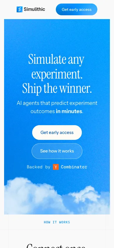
Desktop navigation reduces from 5 visible actions to 2. Hero remains center-aligned; mobile heading size is 46px.
Observed multi-column desktop regions collapse to a single-column mobile flow.Inspect responsive test
- Viewport
- 390 × 844
- Overflow
- No horizontal overflow detected
Reproduction guidance
Do
- Pair the observed #fcfbf9 canvas with #fffbf5 primary copy before adding secondary surfaces.
- Use Instrument Serif at 80px/84.8px, weight 400, for the primary display moment.
- Reserve the strongest first-viewport contrast for “Get early access” within the center-aligned visual-led hero.
- Image led media acts as the page’s primary visual proof rather than decoration.
Don’t
- Do not mix in arbitrary radii; 1px is the repeated treatment on containers.
- Do not reuse the #fffbf5 action color across decorative elements; keep its interactive emphasis selective.
- Do not introduce extra type families beyond Instrument Serif and Instrument Sans.
- Do not add card shadows; the source separates content without repeated elevation.