
System overview
- Hero
- visual-led · left
- Surface
- dark
- Density
- sparse
- Content width
- 1600px full-width canvas
- Confidence
- low
- Primary action
- Book a demo
Color system
Dark surfaces use 8 repeated semantic colors; the primary action carries the strongest interactive emphasis.
Page canvas
Dominant rendered page background.Surface
Repeated container or section fill; relative occurrence score 133.Surface
Repeated container or section fill; relative occurrence score 116.Surface
Repeated container or section fill; relative occurrence score 111.Primary text
Observed display foreground with 12.4:1 contrast against the captured canvas.Secondary text
Observed reading foreground; measured canvas-reference contrast is 6.9:1.Primary action
Fill used by the dominant first-viewport action.Border and divider
Most repeated inspectable border color.Typography
The observed type system assigns Geist Sans to display, heading, body, body-small text; Geist Mono to label text.
Metric previews use the observed CSS values. Source font files are not bundled, so unavailable families fall back locally.Simulate every future. Engineer the response you want.
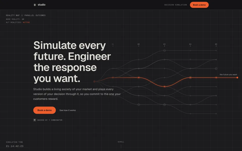
Geist Sans · 70.4px/73.216px · weight 600 · tracking -1.76px · color rgba(240, 237, 230, 0.922)Know how your market reacts before you commit
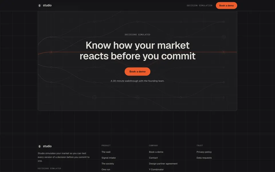
Geist Sans · 57.6px/62.208px · weight 600 · tracking -1.152px · color rgba(240, 237, 230, 0.922)Studio reads the record your market already leaves, public chatter, reviews, and press, alongside…
Geist Sans · 15.5px/26.35px · weight 450 · tracking 0px · color rgba(240, 237, 231, 0.659)Cohorts are named for how they decide, never for who they are. The model holds hundreds more; these…
Geist Sans · 15px/25.5px · weight 450 · tracking 0px · color rgba(240, 237, 231, 0.659)loyal regulars
Geist Mono · 11px/16.5px · weight 400 · tracking 0.99px · color rgba(240, 237, 230, 0.922)Spacing & shape
Spacing
- Base unit
- 4px
- Section gap
- 40px
- Container
- 16px
12px16px8px20px4px10px24px40px28px6pxShape
Rounded geometry is the dominant shape voice. Elevation is selectively reinforced with shadow.
- Pills
- 9999px
- Containers
- 6px
- Media
- 0px
- Cards
- 0px
- Buttons
- 0px
Inspect borders & shadows · 9
1px solid rgba(241, 234, 227, 0.141)1px solid rgba(30, 25, 25, 0.200)1px solid rgba(241, 237, 232, 0.220)1px solid rgb(238, 92, 43)10px solid rgb(183, 173, 157)rgba(28, 26, 23, 0.45) 0px 3px 5px 0px, rgba(0, 0, 0, 0.25) 0px -1.5px 0px 0px inset, rgba(255, 255, 255, 0.35) 1px 1.5px 1.5px 0px insetrgba(28, 26, 23, 0.22) 0px 10px 24px 0pxrgba(28, 26, 23, 0.5) 0px 1px 2px 0px inset, rgba(255, 255, 255, 0.4) 0px 1px 0px 0pxrgba(28, 26, 23, 0.28) 0px 2px 14px 0px inset, rgba(28, 26, 23, 0.1) 0px 0px 60px 0px inset, rgba(28, 26, 23, 0.18) 0px 14px 32px 0pxComponent grammar
Hero
Opening proposition
Visual led, left-aligned opening anchored by “Book a demo”.
Inspect 4 properties
- Pattern
- visual-led
- Alignment
- left
- Heading
- Geist Sans · 70.4px / 600
- Media
- minimal
Navigation
Global wayfinding
Persistent navigation with 1 visible actions in the desktop opening.
Inspect 8 properties
- Background
- rgba(20, 20, 22, 0.82)
- Text
- rgba(240, 237, 230, 0.922)
- Border
- none
- Radius
- 0px
- Padding
- 0px 0px 0px 0px
- Type
- Geist Sans · 16px / 400
- Position
- sticky
- Height
- 65px
Primary action
Conversion
“Book a demo” is the strongest first-viewport action by semantic intent and visual contrast.
Inspect 6 properties
- Background
- #ee5c2b
- Text
- #16110d
- Border
- none
- Radius
- 9999px
- Padding
- 0px 28px 0px 28px
- Type
- Geist Sans · 15px / 600
Content card
Repeated content module
16 style-matched content card instances were found among 16 candidates; properties describe the dominant observed cluster.
Inspect 7 properties
- Background
- #f3f0e9
- Text
- rgba(240, 237, 230, 0.922)
- Border
- 1px solid rgba(30, 25, 25, 0.200)
- Radius
- 0px
- Padding
- 28px 20px 20px 20px
- Type
- Geist Sans · 16px / 400
- Candidate pool
- 16
Badge or tag
Compact status or category label
2 style-matched badge or tag instances were found among 3 candidates; properties describe the dominant observed cluster.
Inspect 7 properties
- Background
- #ee5c2b
- Text
- #16110d
- Border
- none
- Radius
- 9999px
- Padding
- 0px 28px 0px 28px
- Type
- Geist Sans · 15px / 600
- Candidate pool
- 3
Media frame
Visual proof
16 style-matched media elements were found among 31 rendered candidates; cover fitting and 0px are the most repeated treatments.
Inspect 4 properties
- Fit
- cover, fill
- Ratios
- 1.79, 1.57, 1.56, 1.78, 2.27
- Radius
- 0px
- Candidate pool
- 31
Footer
Closing navigation
12 visible actions close the page on a transparent surface.
Inspect 6 properties
- Text
- rgba(240, 237, 230, 0.922)
- Border
- 1px solid rgba(241, 234, 227, 0.141)
- Radius
- 0px
- Padding
- 0px 0px 0px 0px
- Type
- Geist Sans · 16px / 400
- Links
- 12
Layout & narrative
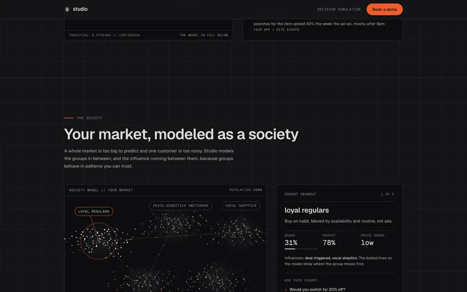
The homepage continues through 19 observed sections, moving from the opening proposition into A thousand worlds, watched at once, It starts by listening, Your market, modeled as a society.
- Structure
- Long-form product catalogue
- Hero pattern
- Visual marquee: imagery carries most of the opening surface
- Grid
- 2 columns
- Closing
- Index footer with 12 actions
Full section sequence · 19
- A thousand worlds, watched at once
- It starts by listening
- Your market, modeled as a society
- Watch a decision play out before you make it
- Where Studio runs
- Built to be doubted
- Know how your market reacts before you commit
- loyal regulars
- Price change
- Menu update
- Launch timing
- Fee rollout
- Store placement
- Cancellation save
- Season pricing
- Story framing
- Groups, not guesses
- What people do, not what they say
- The same answer twice
Imagery, motion & responsive
Imagery
Typography and surface contrast carry the page; rendered imagery is minimal.
cover fitting · square-edged framesInspect imagery inventory
- Composition
- The first viewport is type-led.
- Inventory
- 28 images/canvas elements and 3 videos across the analyzed homepage.
Motion
12 declared keyframes and 40 active animations were inspectable at capture; observed timing uses 8s, 1ms, 0.001ms.
Reduced-motion rules detectedInspect motion inventory
- Libraries
- CSS / browser-native or bundled source not identifiable
- Keyframes
- hairline-draw, view-drift, dash-flow, accordion-down, accordion-up, studio-fade, lab-paper-spin-in, lab-paper-drop-in, studio-marquee, studio-card-in, v6h-cue, v6-mon-drift
- Durations
- 8s, 1ms, 0.001ms, 0.2s, 0.3s, 0.7s
- Easings
- linear, ease, ease-in-out, cubic-bezier(0.22, 1, 0.36, 1)
- States
- focus, hover, disabled
Mobile
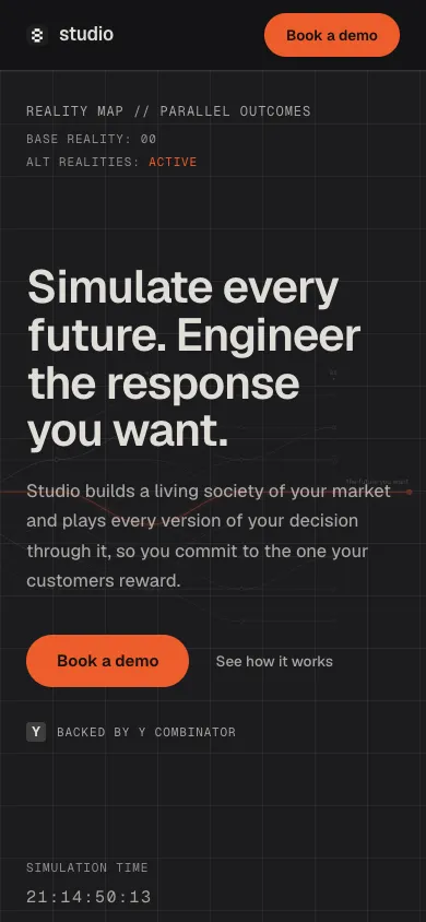
The same 1 visible navigation action remains at mobile width. Hero alignment changes from left to center; mobile heading size is 42.06px.
3 multi-column content regions remain on mobile.Inspect responsive test
- Viewport
- 390 × 844
- Overflow
- No horizontal overflow detected
Reproduction guidance
Do
- Pair the observed #1d1d1f canvas with rgba(240, 237, 230, 0.922) primary copy before adding secondary surfaces.
- Use Geist Sans at 70.4px/73.216px, weight 600, for the primary display moment.
- Reserve the strongest first-viewport contrast for “Book a demo” within the left-aligned visual-led hero.
- Typography and surface contrast carry the page; rendered imagery is minimal.
Don’t
- Do not mix in arbitrary radii; 9999px is the repeated treatment on pills.
- Do not reuse the #ee5c2b action color across decorative elements; keep its interactive emphasis selective.
- Do not introduce extra type families beyond Geist Sans and Geist Mono.
- Do not spread the observed shadow treatment across every container; keep elevation selective.